BRANDING
PACKAGING
BRANDING PACKAGING

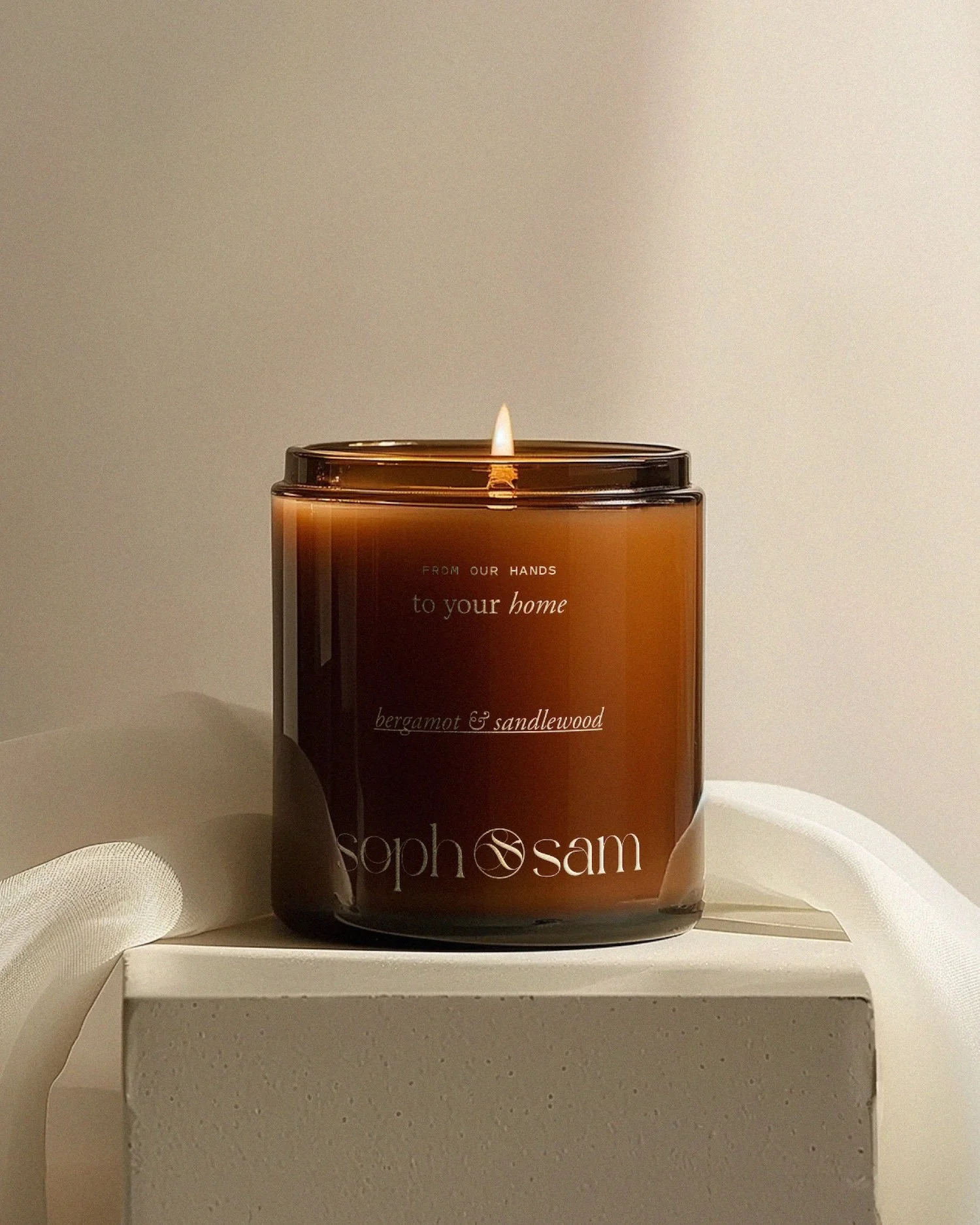
YOU POURED your HEART INTO your PRODUCT.
You tested formulas, sourced the best ingredients, and obsessed over every little detail. So why isn’t it flying off the shelves at the price it deserves?
Here’s a little secret: customers decide whether your product feels luxurious long before they ever try it. Your packaging is the very first impression, and sometimes it’s quietly telling shoppers that your product is ordinary when it’s anything but.
The good news? Most of these mistakes are easy to fix once you know what to look for. Here are five packaging mistakes we see all the time, and how to give your product the luxe look it deserves.
Mistake #1: Trying to Say Everything at Once
Five fonts, four colors, a starburst that says “NEW!”, and every single benefit squeezed onto the front label. We get it, you’re proud of your product (as you should be!). But when everything is shouting, nothing gets heard.
Luxury is all about restraint. Think about the most elegant brands you love: their packaging feels calm, confident, and intentional. They let white space do the talking.
The fix:
Stick to three fonts at most (unless you have a pretty accent font that you’re using sparingly), and a small, intentional color palette.
Put only the essentials on the front: your logo, the product name, and maybe one beautiful descriptor.
Move the ingredients, directions, and extra details to the back or side panel.
Mistake #2: Packaging That Looks Like Everyone Else’s
A standard jar with a simple sticker label can work when you’re first starting out. But if your packaging looks like it came straight from a template, your product starts to blend in with every other brand on the shelf.
Luxury brands have a signature: something that makes you recognize them instantly, even from across the room. It might be a custom illustration, a distinctive color, a unique label shape, or a detail that tells their story.
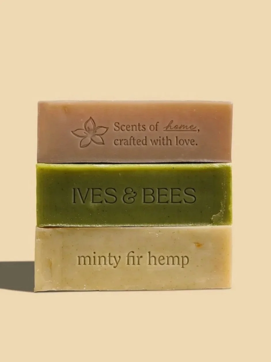
The fix: Find what makes your brand yours and weave it into your packaging. For our Ives & Bees project, we drew botanical illustrations inspired by the Sampaguita, the national flower of the Philippines, and embossed them right into the soap bars. That small detail tells the brand’s heritage story and makes every bar feel special.
Mistake #3: Skimping on Materials and Print Quality
This one is a big one! You can have the most gorgeous design in the world, but if it’s printed on thin, shiny sticker paper that bubbles, peels, or sits a little crooked, your product will feel less expensive the moment someone picks it up.
Luxury is something we feel. The weight of a box, the texture of a label, the shimmer of foil catching the light: these tactile moments are what make a product feel worth the splurge.
The fix:
Choose textured or uncoated label stock for an organic, artisan feel.
Add one special finish, like foil, embossing, debossing, or a soft-touch coating, instead of trying to use them all.
Always order a printed proof before your full run, and check alignment, color, and legibility in person.
Make sure your logo and artwork are high-resolution, vector files so nothing ever looks fuzzy or pixelated.
Mistake #4: No Cohesion Across Your Product Line
Your candle has one look, your body oil has another, and your newest product was designed in a totally different style because you were in a rush. Sound familiar?
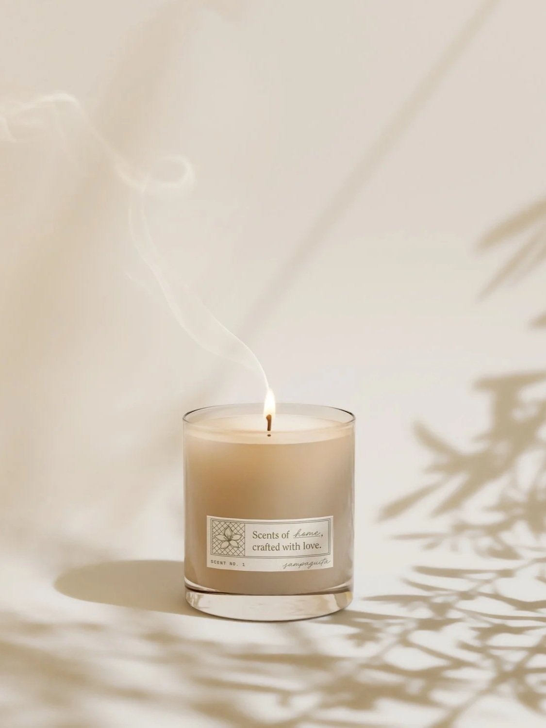
When your products don’t look like they belong to the same family, your brand feels a little scattered, and shoppers have a harder time recognizing you. Luxury brands use a packaging system: a consistent layout, color story, and set of design elements that tie every product together, while still letting each one have its own personality.
The fix: Create a packaging system with a consistent label layout, a set color palette (maybe one accent color per scent or collection), and the same typography across every product. Your shelf should look like a curated collection, not a random mix.
Mistake #5: Forgetting About the Unboxing Experience
You’ve designed a stunning product… and then it arrives in a plain mailer, rattling around in bubble wrap. Womp womp.
For e-commerce brands especially, the unboxing is your storefront. It’s the moment your customer meets your brand in real life, and it’s often the moment they decide to share it on social media (hello, free marketing!).
The fix: You don’t need a huge budget to create a magical unboxing moment. Try:
A branded box or mailer, even a simple one with your logo stamped on it
Tissue paper sealed with a custom sticker
A handwritten-style thank-you card or a little note about your story
A small sample, a sprig of dried florals, or a touch of your signature scent
Every layer is a chance to make your customer feel cared for, and that’s what turns first-time buyers into loyal fans.
LUXURY is IN the DETAILS
Luxury doesn’t have to mean expensive. It means intentional. When every element of your packaging is thoughtfully chosen, from the font to the finish to the tissue paper, your customers can feel it. And when they can feel it, they’re happy to pay for it.
READY to ELEVATE your PACKAGING?
If your products deserve a makeover, we’d love to help! At WK Creative Studio, we design thoughtful, feminine packaging for heart-led beauty, fashion, and lifestyle brands, packaging that looks as beautiful as what’s inside.
Our Pretty & Premium package was made for product-based brands like yours. It includes full brand strategy, a custom identity, packaging design, and collateral, all tied together with a style guide and built-in PR support to help you launch with confidence.
Let’s chat about your packaging →
Want more packaging inspiration? Read How to create an intentional, heart-led packaging experience